Responsive site -Checkout flow

From concept to delivery.

See how we redesigned the journey for 88.3M users.

From concept to delivery.

See how we redesigned the journey for 88.3M users.

2023

Responsive site - Checkout flow

From concept to delivery.

See how we redesigned the journey for 88.3M users.

2023

Company

Claro - LATAM
Claro is the largest telecommunications companies in Latin America, owned by the Mexican group América Móvil, with a strong presence in Brazil. It offers mobile services (including 5G, where it is a leader), broadband, landlines, and pay TV.

Tools

Figma

Hotjar

Maze

Google analytics

CSAT

Project Objectives

Project Objectives

Project Objectives

Briefing

Briefing

The project focuses on improving Claro's checkout flow with a data-driven approach and usability testing. Starting with the portability experience, research identifies key pain points, leading to design enhancements for clarity and simplicity.

Challenges faced

Align Business, User and Technology


The company is very large and has several teams. I had to align and request data from several squads, such as CRO, Design System, Data Analytics, web development, and stakeholders.

Align Business, User and Technology


The company is very large and has several teams. I had to align and request data from several squads, such as CRO, Design System, Data Analytics, web development, and stakeholders.

Lead multiple teams


Work with data management and CRO management to collect unique events from the portability journey and create hypotheses and perform periodic tests in Maze.

Lead multiple teams


Work with data management and CRO management to collect unique events from the portability journey and create hypotheses and perform periodic tests in Maze.

Wicked problems
As I collected data and conducted in-depth research, more issues emerged in the site's ecosystem. I used facilitation dynamics with product time to define a new MVP and roadmap.

Wicked problems
As I collected data and conducted in-depth research, more issues emerged in the site's ecosystem. I used facilitation dynamics with product time to define a new MVP and roadmap.

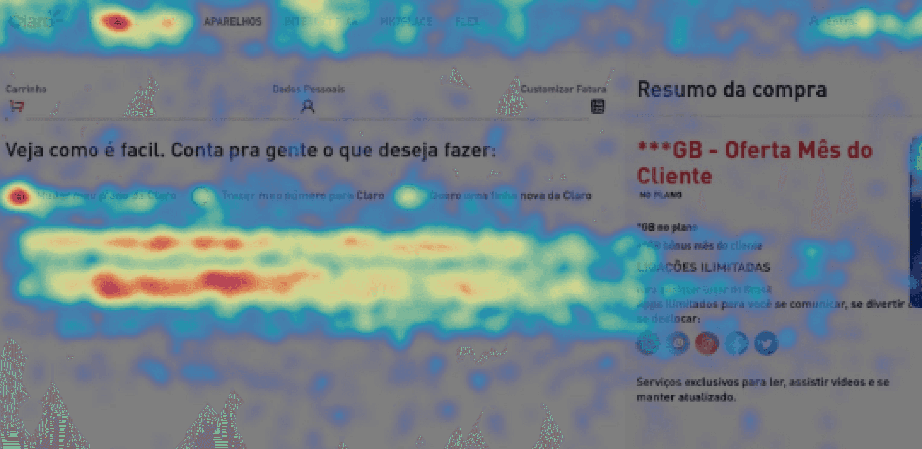
Mouse movimentation and hotmap analysis

Problems encountered

There were too many flow exits.

The user didn't understand the product.

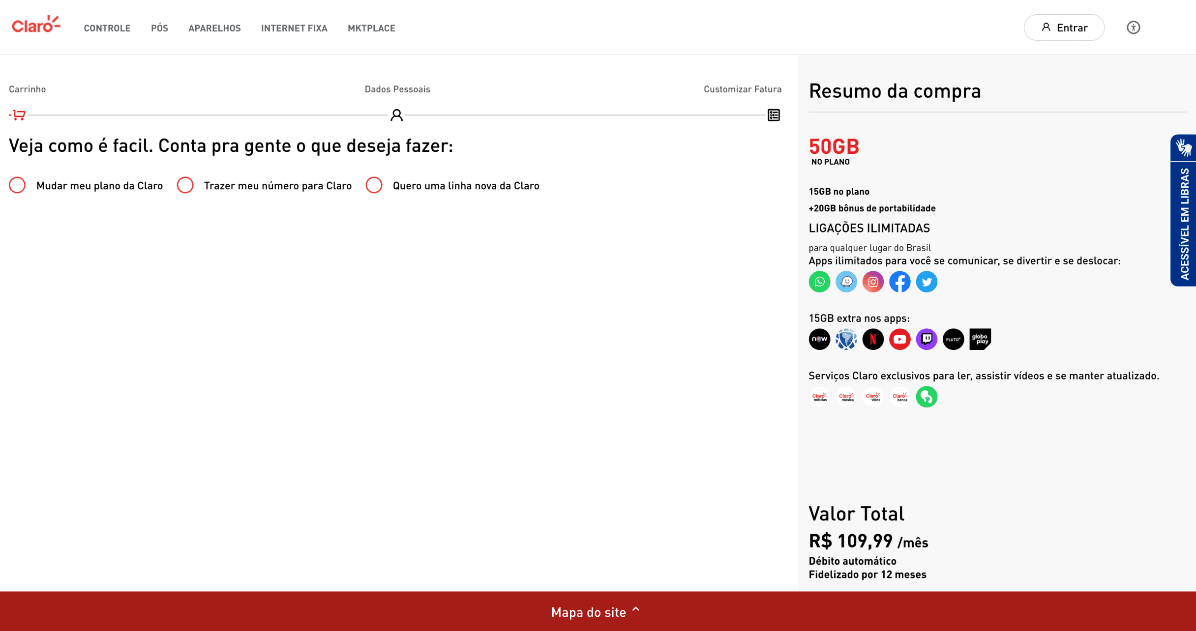
Lots of information on screen


Problems encountered

There were too many flow exits.

The user didn't understand the product.

Lots of information on screen


Problems encountered

There were too many flow exits.

The user didn't understand the product.

Lots of information on screen


Mouse movimentation and hotmap analysis

Problems encountered

There were too many flow exits.

The user didn't understand the product.

Lots of information on screen


Problems encountered

There were too many flow exits.

The user didn't understand the product.

Lots of information on screen


Problems encountered

There were too many flow exits.

The user didn't understand the product.

Lots of information on screen


Convertion numbers

Convertion numbers

55%

churn per million unique events,drop-off rate on

the first click


55%

churn per million unique events,drop-off rate on the first click


Convertion numbers

Convertion numbers

55%

churn per million unique events,drop-off rate on

the first click


55%

churn per million unique events,drop-off rate on the first click


What I did as Product Designer

What I did as Product Designer

What I did as

Product Designer

Validate hypotheses

Validate hypotheses

Through more than 100 Hotjar videos to analyze user behavior, we realized that they clicked on all the fields on the screen, thinking they were clickable, in addition to returning to the home screen.

1- The customer tries to understand more about the benefits by clicking on them, but there are no details about the product.
2- There's no way to exchange the product in the cart, so they have to return to the home page.
3- There was no way to compare products, so users did it manually, significantly increasing the number of churning in the checkout'flow.

tESTS

tESTS

1- Several A/B test follow-ups were carried out with the help of the CRO team.


2- I ran usability tests to find the main issues with the flow.


3- I checked if there was accessibility in the entire flow, including in the HTML code.
4- I checked the SEO of the main terms in the checkout flows.

Design System - Mondrian


Design System

It was tested and selected along with the development time that the site was out of date. 87% of its components were not connected to design system.

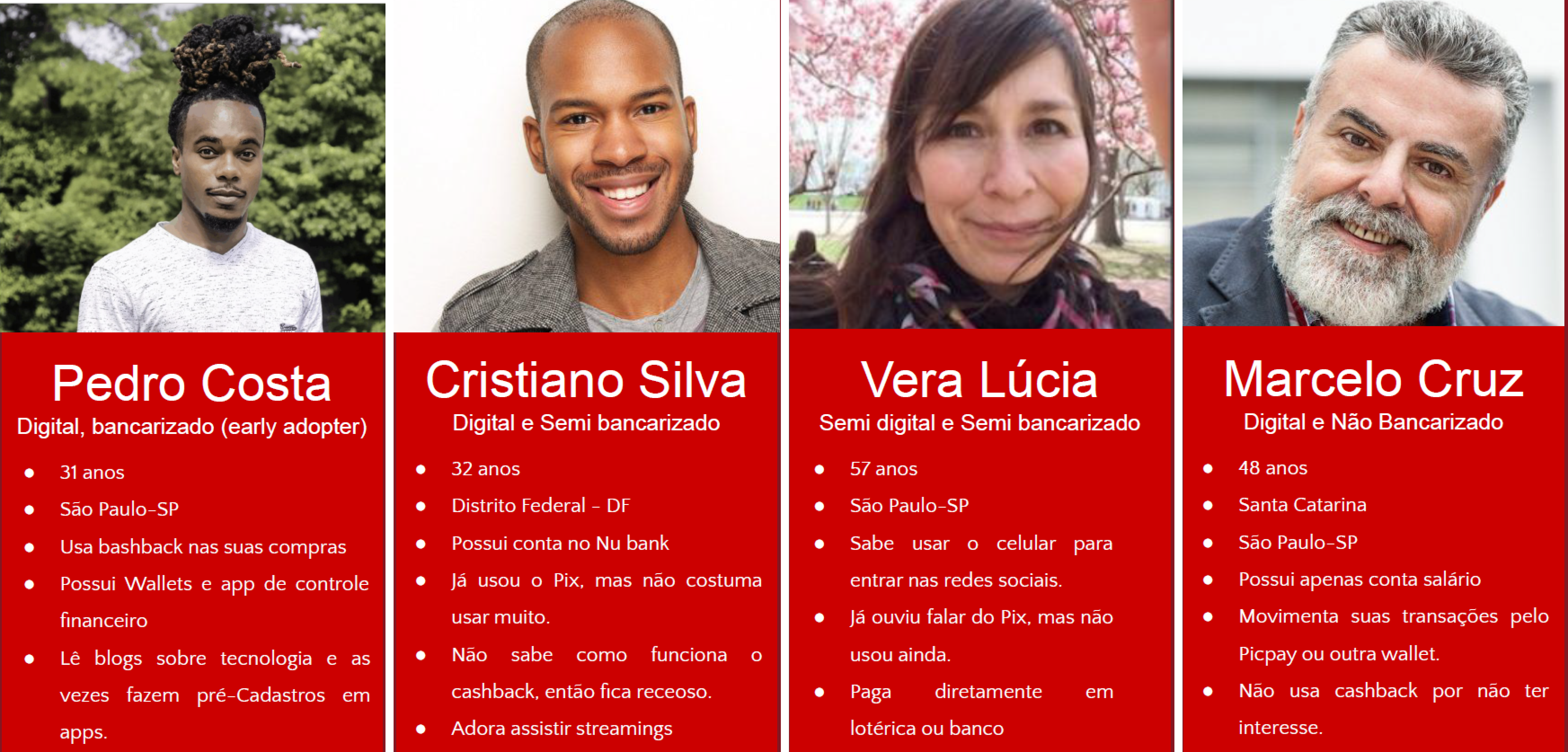
Wireframes,personas and design critique

Wireframes, personas

and design critique

After studying the data, I created the screens and led a design critique with more than 23 designers to identify improvements to Claro's checkout flow.

Of 4,244 reviews collected and analyzed via Hotjar, it was found that almost half of users disliked the checkout experience.

Of 4,244 reviews collected and analyzed via Hotjar, it was found that almost half of users disliked the checkout experience.

Low satisfaction

Low satisfaction

1.191

hated the
user experience

740

dislike the
user experience

1931

negative coments

1931

Low satisfaction

Of 4,244 reviews collected and analyzed via Hotjar, it was found that almost half of users disliked the checkout experience.

1.191

hated the
user experience

740

dislike the
user experience

negative coments

Results and actions

Results and actions

How many user’s gonna be impacted?

Claro mobile

Customers inpacteds

88,3M

How many user’s gonna be impacted?

How many user’s gonna be impacted?

88,3M+

Claro mobile

Customers inpacteds

1.1m+ per month

unique events at checkout

unique events at checkout

+ Portability new customers

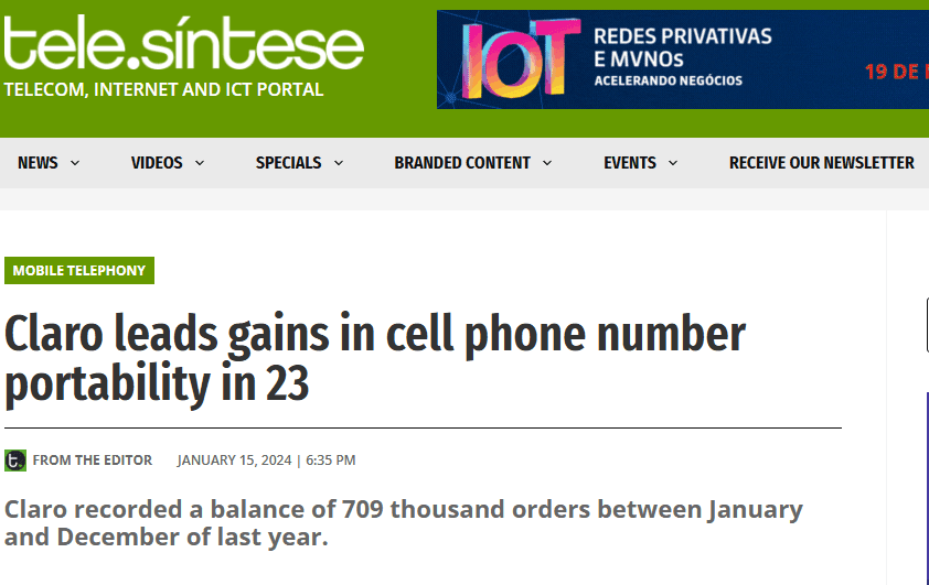
709k in 2023

+ Portability new customers

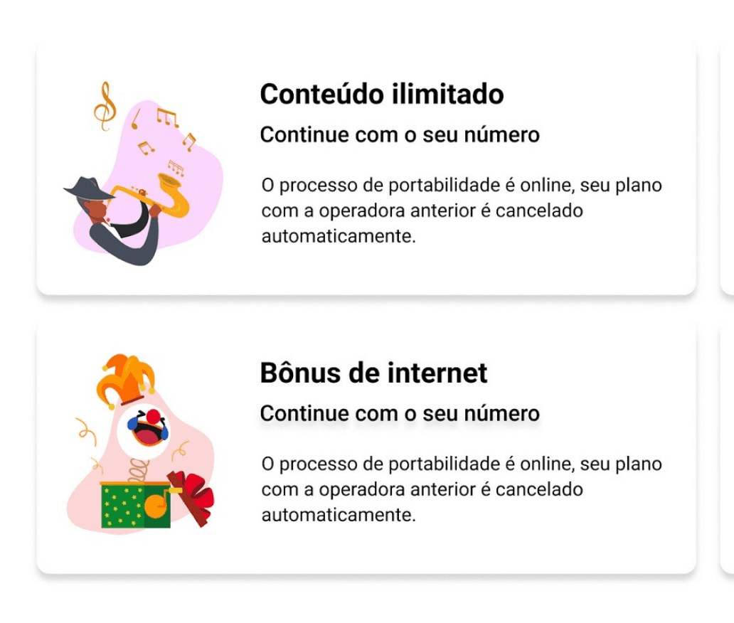
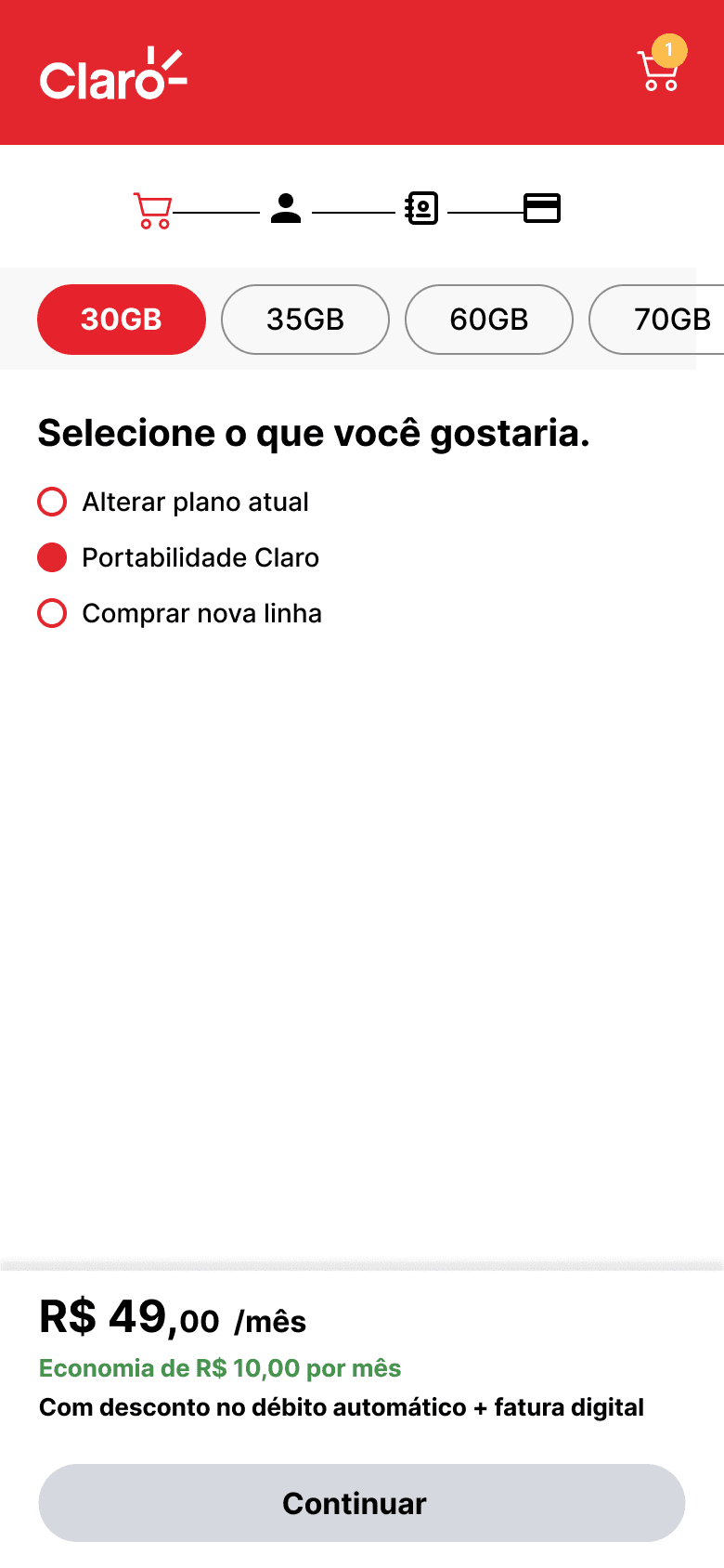
1- Optimized Cart: Clear layout with easy editing options.


2- Purchase Confirmation: Detailed summary and additional post-purchase options.


3- Dedicated Area: Create a specific section for portability with clear benefits.


4- Simplified Flow: Redesign the journey with intuitive steps and immediate feedback, step-by-step process with relevant information.


5- Optimized Content: Present information clearly and concisely.


6- Responsive Design: Ensure a consistent experience across all devices.


7- Improve accessibility and SEO.
There was no word referring to portability on the entire Claro's website, or were there any citations in the site's HTML. Disabled users who needed support couldn't find the portability flow anywhere. Furthermore, due to a lack of correct keywords, our site wasn't displayed in search results, which drastically impacted SEO.


1- Optimized Cart: Clear layout with easy editing options.


2- Purchase Confirmation: Detailed summary and additional post-purchase options.


3- Dedicated Area: Create a specific section for portability with clear benefits.


4- Simplified Flow: Redesign the journey with intuitive steps and immediate feedback, step-by-step process with relevant information.


5- Optimized Content: Present information clearly and concisely.


6- Responsive Design: Ensure a consistent experience across all devices.


7- Improve accessibility and SEO.
There was no word referring to portability on the entire Claro website, or were there any citations in the site's HTML. Disabled users who needed support couldn't find the portability flow anywhere. Furthermore, due to a lack of correct keywords, our site wasn't displayed in search results, which drastically impacted SEO.

1- Optimized Cart: Clear layout with easy editing options.


2- Purchase Confirmation: Detailed summary and additional post-purchase options.


3- Dedicated Area: Create a specific section for portability with clear benefits.


4- Simplified Flow: Redesign the journey with intuitive steps and immediate feedback, step-by-step process with relevant information.


5- Optimized Content: Present information clearly and concisely.


6- Responsive Design: Ensure a consistent experience across all devices.


7- Improve accessibility and SEO.
There was no word referring to portability on the entire Claro's website, or were there any citations in the site's HTML. Disabled users who needed support couldn't find the portability flow anywhere. Furthermore, due to a lack of correct keywords, our site wasn't displayed in search results, which drastically impacted SEO.

Dedicated area and flow to improve

SEO’s site and acessibility

Constants usability tests and A/B tests

Dedicated area to improve

SEO’s site and acessibility

Constants usability tests and A/B tests

We are in the news

We are in the news

Convertion numbers

55%

churn per million unique events,
drop-off rate on the first click

Convertion numbers

55%

churn per million unique events,
drop-off rate on the first click

Mouse movimentation and hotmap analysis

Problems encountered

There were too many flow exits.

The user didn't understand the product.

Lots of information on screen

Mouse movimentation and hotmap analysis

Problems encountered

There were too many flow exits.

The user didn't understand the product.

Lots of information on screen

designed by Henrique

designed by Henrique

designed by Henrique

Create a free website with Framer, the website builder loved by startups, designers and agencies.